Rajasthan Board RBSE Class 11 Economics Notes Chapter 7 Presentation of Data
→ Collected data items are in complex and unorganised form.
→ Data collected in its original form are similar to a heap of numbers.
→ It is also necessary to make the collected information simple, brief and comprehensible to facilitate comparitive study, analysis and selection of data.
→ Proper presentation of data is required in order to easily understand and use the collected data.
→ Normally, data can be presented in three different ways.
![]()
→ The details of data collected is described in the lesson. For less result oriented data, this is a more useful way of presentation.
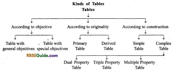
→ After collecting statistical data or facts and classifying them properly, it is necessary to tabulate them in order make it suitable for comparison and interpretation.
→ In general sense, tabulation is an ordered/sequential arrangement of presenting data in rows and columns.
Presenting data in an organised manner, to show data in a concise and consistent form, and to make the problem easier and clearer, is the purpose of tabulation.
→ A good table has the following main parts-
- Table number
- Heading
- Sub-heading of cells/boxes and rows
- Main part/Body of the table
- Drawing lines and leaving vacant spaces
- Number of items
- Unit of measurement
- Footnotes
- Source/origin
→ The composition of a good table largely depends on the ability of the researcher, his common sense and experience.
→ Data are by nature uninteresting.
![]()
→ The presentation of data can be understood in a simple and quick manner through pictures and graphs.
There are two methods of presentation of data in statistics
- Diagrammatic presentation of data
- Graphical presentation.
→ Construction of diagrams is a special-skill work, and the true sense of data can be shown through them. Thus, diagrams should be made very carefully.
→ Statistical charts are mainly of five types-
1. One-dimensional diagram :
- Line Diagram
- Simple Bar Diagram
- Multi-property Bar diagram
- Inter-segregated Bar diagram
2. Two-dimensional diagram:
- Rectangular diagram
- Square diagram
- Circular diagram (Pie-chart)
3. Three-dimensional diagram
4. Pictograms
5. Cartograms
→ Generally, frequency of the data collected in the form of grouped frequency distribution can be represented by frequency graphs (ogives).
→ The rectangular frequency diagram is used to display continuous class data.
→ If the class-interval is inclusive then we should first convert it into an exclusive series.
→ The multi sided image, created on the basis of item values or mid-point, and midpoint and their frequencies, is called frequency polygon.
![]()
→ Frequency curve is a smoothed form of a frequency polygon.
→ Frequency curve can be presented very easily by moving closest to the points (vertex) of frequency polygon and drawing a free-hand curve.
→ When the upper limits of class-intervals are taken on X-axis and cumulative frequencies are taken on Y-axis and a curve is thus plotted, it is called a cumulative frequency curve.
→ Median and other division values (one fourth, one-tenth, one eighth one hundred) can be easily determined with the help of cumulative frequency curves.
→ The point where ‘less than’ curve intersects the ‘more than’ curve, gives the median point.
Presentation of Data Class 11 RBSE Notes Important Terms
• Tabulation: To present data in columns and rows in an ordered form, is called tabulation.
• Complex Table: A table which reveals more than one properties of data.
![]()
• Ordinary Table: A series that displays 1 property of data.
• Bar-Diagram: The picture in which the data is displayed in form of bars or rectangles.
• Multi-property Bar diagram: Such a diagram in which the data of two or more curves is displayed by bars.