Connecting the Dots Class 7 Notes
hardConnecting the Dots Class 7 Notes
Connecting the Dots Class 7 Notes
1. Definition of Statistics
Involves collecting, analyzing, interpreting, presenting, and organizing data.
Purpose: Helps make informed decisions based on data analysis and understand trends and relationships.
2. Statistical Questions
Characteristics : Anticipate variability and require data collection.
Examples :
What is the average height of students in a classroom?
How many hours do students spend on homework each week?
3. Arithmetic Mean
Mean (Arithmetic Mean):
Definition : Sum of all values divided by the number of values.
Formula :
Mean = [latex]\frac{\text { Sum of all values }}{\text { Number of values }}[/latex]
Fair Share Concept: Represents an equal distribution of total value.
Median :
Definition : Middle value in a sorted dataset.
Calculation:
If odd number of values : Middle value.
If even number of values : Average of the two middle values.
Example : For the dataset {2, 3, 3, 5, 7} the median is 3.
Importance : Less affected by outliers compared to the mean.
4. Outliers
Definition : An outlier is a value in a data set that is significantly different from the other values. It can be much higher or much lower than the rest of the data points.
Examples : In heights 1140, 145, 150, 155, 1801. the height 180 is an outlier.
Effect on Mean and Median :
Outliers can affect the mean but have minimal effect on the median.
Example: In {1, 2, 3, 4, 100}, mean = 22, median = 3.
5. Representation Dot Plot:
Definition : A graphical representation where each data point is shown as a dot.
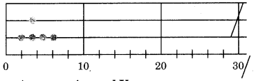
Purpose: Visualises distribution and frequency. Example : For data points {2, 3, 3, 5, 7}, the dot plot would show dots above these values on a number line.
Bar Graphs:
Types : Clustered Column Graph : Displays data in vertical bars grouped by categories.
Double Column Graph : Compares two sets of data side by side.
Example : Comparing average scores of two classes in different subjects.
6. Describing Data
Minimum Value: Smallest value in the dataset.
Maximum Value: Largest value in the dataset.
Sum Total: Total ofall values.
Range: Difference between maximum and minimum values.
Range = Maximum - Minimum
7. Analyzing Data Mean vs. Median:
(a) Close Together : This indicates a symmetrical distribution without significant outliers. For example, in the dataset {3, 4, 5, 6, 7}, both the mean and median are 5.
(b) Mean < Median : This suggests a left- misleading distribution, where lower values pull the mean down. For example, in the dataset {1,2, 3, 4, 20}, the mean is 6, while the median is 3.
(c) Mean > Median : This indicates a right- skewed distribution, where higher values pull the mean up. For example, in the dataset {1, 2, 3, 4, 100}, the mean is 22, while the median is 3.
Zero vs. No Value:
Zero: Represents a quantity (e.g., score of 00).
No Value: Absence of data (e.g., absent student).
8. Practical Applications
Averages in Real Life : Used in sports scores, temperatures, prices, etc.
Importance of Data Analysis : Helps in making informed decisions and understanding patterns.
CHAPTER AT A GLANCE
- Statistical Statement: A claim or summary about something that uses numbers.
- Statistical Question : A question that can be answered by collecting data.
- Data : Information collected for analysis. This can be numbers, measurements, or observations that help us understand something better.
- Mean : The average of a set of numbers.
- Median: The middle value in a list of numbers when they are arranged in order.
- Outlier : A number that is much higher or lower than the other numbers in a data set.
- Double-Bar Graph : A type of graph that uses two bars for each category to compare two sets of data.
- Clustered-Bar Graph : Similar to a double-bar graph, but it shows more than two sets of data side by side for comparison. This is useful when you want to compare multiple groups at once.
- Scale : A system used on graphs to represent data accurately.
- Survey : A method of collecting data by asking people questions. Surveys can help gather opinions or preferences from a specific group.
Of Questions and Statements
Define Statistics : Statistics is a branch of mathematics that deals with collecting, analysing, interpreting, presenting, and organizing data. It provides tools for making informed decisions based on data analysis and helps in understanding trends, patterns, and relationships within the data.
Examples of Statistical Questions: Statistical questions are those that anticipate variability in the data and can be answered by collecting data. Here are some examples :
- What is the average height of students in a classroom?
- How many hours do students spend on homework each week?
- What is the distribution of scores on a math test?
Of Questions and Statements
Define ‘Average’ or ‘Arithmetic Mean (AM.)’ or Simply Mean
The average, often referred to as the arithmetic mean, is calculated by summing all the values in a dataset and dividing by the number of values. It is a measure of central tendency that represents a typical value in the dataset.
The formula for the arithmetic mean is given by:
Mean = [latex]\frac {Sum of all values}{Number of values}[/latex]
Average as Fair-Share
The arithmetic mean can be thought of as a “fair share” because it distributes the total value evenly among all observations.
For example, if five students scored a total of 400 points on a test, the average score would be 80 points, indicating that if the points were shared equally, each student would receive 80 points.
Explain Arithmetic Mean in Ancient Indian Mathematics
In ancient Indian mathematics, the concept of arithmetic mean was referred to as “samamiti.” This term emphasises the idea of equality and balance, reflecting the notion that the mean represents a central value around which data points are distributed.
The Arithmetic Mean as the ‘common’ or ‘equalising’ value that is a representative measure of a collection of values.
Know Your Onions!
Describe Data Using Minimum, Maximum, Average, Sum, and Range
Data can be described and compared using several key statistics :
- Minimum Value : The smallest value in the dataset.
- Maximum Value : The largest value in the dataset.
- Average Value : The mean of the dataset.
- Sum Total : The total of all values in the dataset.
- Range: The difference between the maximum and minimum values, calculated as :
Range = Maximum - Minimum
These statistics provide a comprehensive view of the dataset’s characteristics.
Explain Dot Plot
A dot plot is a simple graphical representation of data where each data point is represented by a dot along a number line. It helps visualise the distribution, frequency, and patterns in the data.
For example, if we have the following data points: 2, 3, 3, 5, 7, the dot plot would look like this :
Averages Around Us
Averages are commonly used in various situations, such as calculating average scores in sports, average temperatures, and average prices. They help summarize large datasets into a single representative value.
Outliers and Medians
What is an Outlier?
An outlier is a value in a data set that is significantly different from the other values. It can be much higher or much lower than the rest of the data points. For example, if most students in a class have heights between 140 cm and 160 cm, but one student is 180 cm tall, that height of 180 cm is considered an outlier. Outliers can affect statistical measures like the mean and can give ainaccurate view of the data.
What is the Median?
The median is the middle value of a data set when it is arranged in ascending order. If there is an odd number of values, the median is the middle one. If there is an even number of values, the median is the average of the two middle values. The median is a good measure of central tendency, especially when there are outliers, because it is not affected by extreme values.
Explain Median with Table Question as Dot Plot
To find the median, arrange the data in ascending or descending order and identify the middle value. If there is an even number of observations, the median is the average of the two middle values. For example, consider the following dataset:
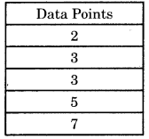
The sorted data is already in order. Since there are five values, the median is the third value :
Median = 3
If we had an even number of values, say 2, 3, 3, 5, 7, 8, the median would be :
Median = [latex]\frac {3+5}{2}[/latex] = 4
Explain Outlier
An outlier is a value that lies significantly outside the range of the other values in a dataset. For example, in the dataset {2, 3 ,3, 5,100}, the value 100 is an outlier. Outliers can affect the mean but have little impact on the median.
Data Analysis Based on Mean and Median
When analysing data, the relationship between the mean and median can provide insights into the distribution :
(a) Mean and Median Close Together :
This indicates a symmetrical distribution without significant outliers. For example, in the dataset {3, 4, 5, 6, 7}, both the mean and median are 5.
(b) Mean < Median : This suggests a left- misleading distribution, where lower values pull the mean down. For example, in the dataset {1, 2, 3, 4, 20}, the mean is 6, while the median is 3.
(c) Mean > Median : This indicates a right- skewed distribution, where higher values pull the mean up. For example, in the dataset (1,2,3,4,100}, the mean is 22, while the median is 3.
Of Ends and the Essence
Explain Zero vs. No Value
In statistics, “zero” is a numerical value that represents a quantity, while “no value” indicates the absence of data or a measurement. For example, if a student scores zero on a test, it means they answered no questions correctly. In contrast, if a student was absent and has no score recorded, it reflects a lack of data rather than a score of zero.
Of Questions and Statements
Plot Data in Graph
(a) Clustered Column Graph: This type of graph displays data in vertical bars grouped by categories. For example, if we compare the number of books read by students in two classes, we could have :
| Class A | Class B |
| 5 | 3 |
| 7 | 8 |
| 6 | 5 |
(b) Double Column Graph: This graph allows for comparing two sets of data side by side. For example, if we compare the average scores of two classes in different subjects :
| Subject | Class A | Class B |
| Math | 85 | 78 |
| Science | 90 | 88 |
| English | 80 | 82 |
Understanding Information in Graphs
To effectively interpret graphs, follow these steps :
- Identify What is Given : Look at the axes, labels, and data points to understand what information is being presented.
- Infer from What is Given : Draw conclusions based on the visual representation. For example, if one bar is significantly taller than another, it indicates a higher value in that category.
Data Detective
How to Draw a Graph Effectively
- Choose a Suitable Scale : Decide on a scale that fits your data. Ensure it allows for clear representation of both sets.
- Label Axes Clearly : The horizontal axis (z-axis) should represent the categories being compared, while the vertical axis (y-axis) shows the values.
- Use Different Colours : Assign distinct colours for each data set to make it easy to differentiate between them.
- Include a Legend : A legend helps viewers understand what each colour represents.
- Title Your Graph : A clear title summarizes what the graph is about.
- Check for Accuracy : Ensure all bars are drawn to the correct height according to the data.