The following line graph shows the number of births in every month in India over a time period : Class 8
easyThe following line graph shows the number of births in every month in India over a time period : Class 8
Question 1.
The following line graph shows the number of births in every month in India over a time period : Class 8
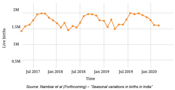
(i) What are your observations?
(ii) What was the approximate number of births in July 2017?
(iii) What time period does the graph capture?
(iv) Compare the number of births in the month of January in the years 2018, 2019, and 2020.
(v) Estimate the number of births in the year 2019.
Solution:
(i) Number of births is more in the months of August, September and October in comparison to other months of the year.
(ii) About 1.8 M.
(iii) Time period captured by the graph is April 2017 to March 2020.
(iv) Number of births in the month of January in the years 2018, 2019 and 2020 is nearly the same.
(v) It is above 20.5 M.
Question 2.
Share your observations. Based on this infographic, answer the following : Class 8
(i) The value of Karnataka is hidden. Can you guess what it could be?
(ii) Which are the top 5 states where rice is the most popular?
(iii) Which are the top 5 states where wheat is the most popular?
(iv) List a few states where the preference between rice and wheat is more or less balanced.
Solution:
(i) It could be +90.
(ii) Manipur, Nagaland, Arunachal Pradesh, West Bengal, Tamilnadu.
(iii) Punjab, Haryana, Madhya Pradesh, Rajasthan, Delhi.
(iv) Uttar Pradesh, Bihar, Gujarat.